
← Case studies page
Linkedin Design Challenge

Design an experience that helps college students discover and connect to their classmates.
Students of a university need to be more active on Linkedin Groups to network with their fellow classmates so that they are more exposed to more job opportunities. The proposed design solution helps students discover and connect with their classmates more than before.
To illustrate the problem space to audience about the issue that I was trying to solve


I began to question- WHY DON'T STUDENTS INTERACT WITH OTHER CLASSMATES ON LINKEDIN?
To make it easier for me to plan the week long project and to work efficiently. I decided to split the week into 3 distinct phases
1. Inspiration
2. Ideation
3. Implementation

Click Timeline to expand
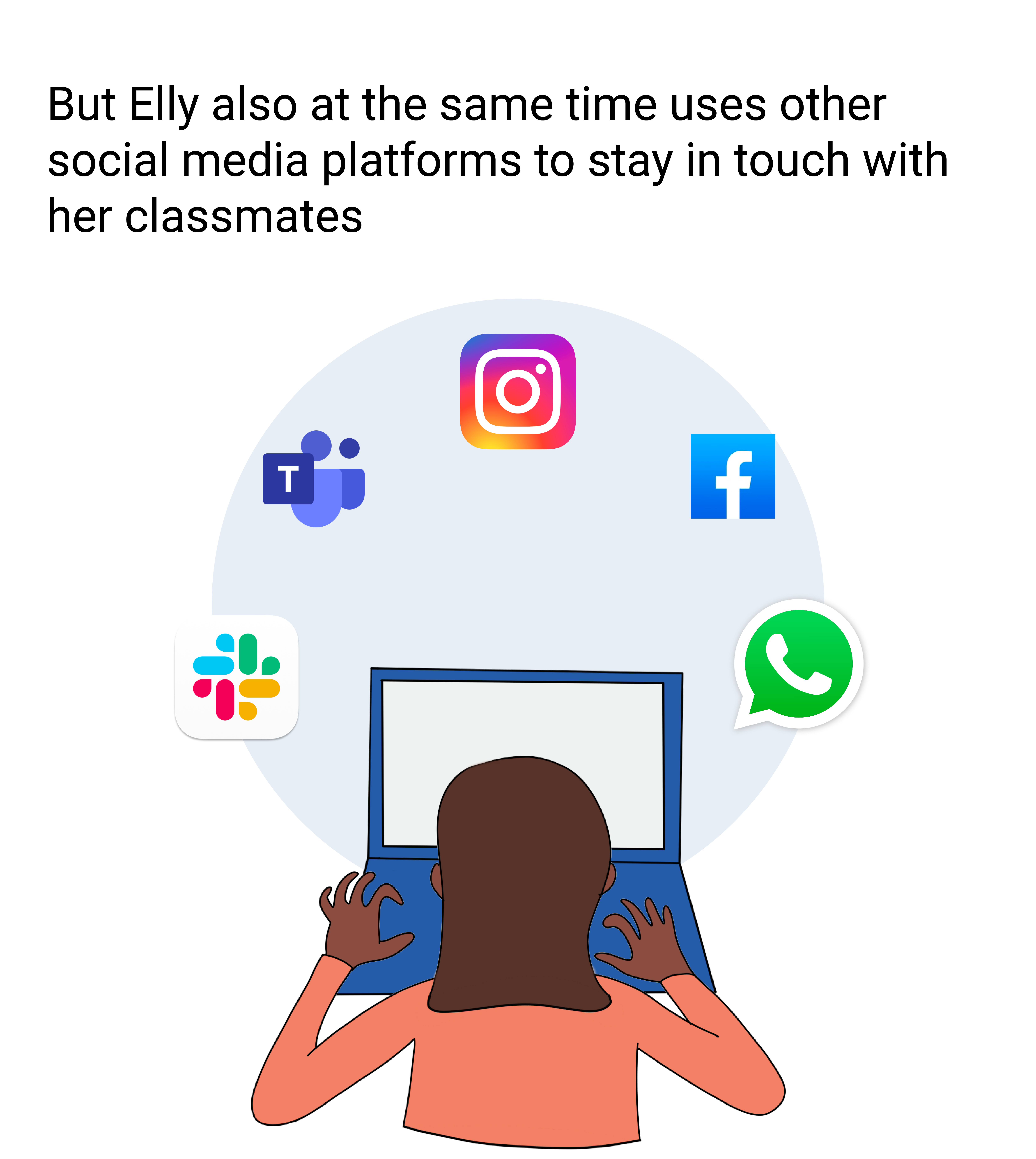
To understand the problem space better before going into interviews. Conducted literature survey to understand what the most preferred medium of communication is among students.
Helped gain insight on the various social media applications used by college going students and how popular Linkedin is among them. Also gained insights on what other platforms they use for making professional and personal connections.

"Around half of college graduates and those who live in high-income households use LinkedIn, compared with 10% or fewer of those who have not attended at least some college or those in lower-income households."
LinkedIn has 39 million students and graduate members, and 46% of recent grads use it for job hunting. Additionally, this group is the fastest growing and the most active on all social networks.


Scoured through Linkedin to figure out what kind of features already exist where classmates can regularly post updates to a closed community.
Found the existence of Linkedin Groups.
Groups on LinkedIn allow members to share insights and experiences, ask for guidance, and make connections with others in their fields and with similar interests.
I recognized that it is challenging to find and work around groups especially on mobile phones.

To gather information on some of the pain points of 6 users feel with respecting to finding and interacting with their classmates from their cohort on Linkedin
Got concrete proof from the 6 graduate students, that they struggle to-
1. Find Linkedin Groups
2. Filter out unnecessary posts in the groups and pages
3. Find their classmates on Linkedin
4. Figure out how many in a group are their classmates
The above mentioned factors prevent them from being active on Linkedin Groups and interacting with their classmates
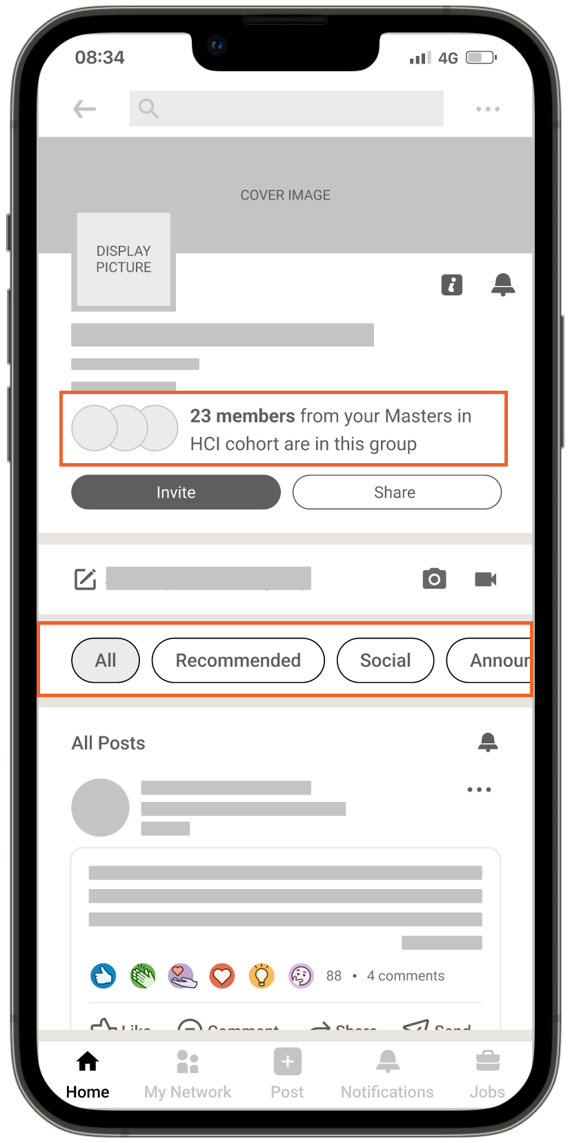
Finding Linkedin Groups
"I don't remember being a part of a Linkedin Group"
"How do I even find the groups?"
"It's too many click to get to the groups"
"I didn't even realize that the groups were in the mobile menu"
"I never noticed the groups on the menu, I used to visit them from- Manage my network"
Filtering out unnecessary posts
"Not active because there are so many posts that are not relevant to me"
"Can not find posts that are related to my interests"
"It would be convenient to have a filter to see the posts that I want it would increase my participation in the groups"
Finding classmates on Linkedin
"I'd appreciate suggestions based on my graduation date and cohort"
"Just like how it suggests me people in my university, it would be cool to see people from my class"
"I don't remember my classmates names since we have virtual classes now and would like suggestions on linkedin"
"I have had trouble connecting with my classmates because I have not had the opportunity to talk to them in class"
Validating the legitimacy of the group
"Would like suggestions based on my classmates involvement in the group"
"If there was prior information about my classmates in the group, it would help me make a decision if I want to join the group"
"I would like to know the authenticity of the group to help with my course"

Conducting User Interviews

Note taking
Creating personas is a good way to build realistic and reliable representations of your target audience segments.

"How do I maximize my interaction with my classmates on Linkedin so that I can network with them and hopefully even increase my chance of job opportunities"
After my preliminary round of user research, I decided to spend my time trying to come up with design solutions that would achieve the following-
Enhance the visibility of the groups in the mobile menu
View only posts of interest on the group
Connection suggestions based on their program at the university
Hand out prior information about the number of classmates in the group
The main aim of the design solutions is to improve the participation and discovery of groups where classmates can interact with each other.


Finding Linkedin Groups
"I don't remember being a part of a Linkedin Group"
"How do I even find the groups?"
"It's too many click to get to the groups"
"I didn't even realize that the groups were in the mobile menu"
"I never noticed the groups on the menu, I used to visit them from- Manage my network"
The purpose of the dedicated Highlighted group on the navigation pane is to make sure that the groups section does not go unnoticed by the users.
The order of the groups are arranged according to the number of new updates or posts on it.
There is an option to expand the section to view all the groups that a user has subscribed to.

Filtering out unnecessary posts
"Not active because there are so many posts that are not relevant to me"
"Can not find posts that are related to my interests"
"It would be convenient to have a filter to see the posts that I want it would increase my participation in the groups"
The additional category tags assist in filtering out content on the group and also at the same time subscribe notifications to specific categories.
This would help in sorting the content for the user to find relevant posts with respect to the user's interested fields.

Finding classmates on Linkedin
"I'd appreciate suggestions based on my graduation date and cohort"
"Just like how it suggests me people in my university, it would be cool to see people from my class"
"I don't remember my classmates names since we have virtual classes now and would like suggestions on linkedin"
"The lack of opportunity to talk to my classmates has hindered my ability to connect with them"
The connection suggestions offered could be based on their program at the university much like how Linkedin already offers suggestions based on the university that the user is attending.
This would help users connect with other students from their program.

Validating the legitimacy of the group
"Would like suggestions based on my classmates involvement in the group"
"If there was prior information about my classmates in the group, it would help me make a decision if I want to join the group"
"I would like to know the authenticity of the group to help with my course"
The redesign has a prompt below the title of the group listing the number of the user's classmates in the group.
It would help validate the group and entice users to join it to keep themselves connected to their network.
I enjoy the usability test phase in the design process because there is a steep learning curve during this step. I gain insight into design flaws that I might have overlooked. I learnt a great deal about the effectiveness of the design by watching how three test users interacted with the proposed design.
I heard a common frustration from the users regarding my redesign of the group screens.
1. Users saw no point in displaying the classmate connections in the group after joining it.
2. Users wanted the option to search for posts within the category filters to help discoverability of relevant posts.
Information regarding classmates in the group and the option to search them.

Additional option to search within the specific category .

Home Screen

Mobile Menu

Post Categories in the Group

Viewing all Connections in the Group

Post Categories when Starting a New Post in the Group

Posts on the Group of the "Social" category

Connections in the group based on the user's cohort

Connection Suggestion based on Program at University

Please View Video at resolutions over 720p
North Star: Monthly Active Users
Success Metrics to measure the success of the product:
1. Daily Active User/Monthly Active User ratio:
To be aware of how many graduate students are being onboarded
2. AARRR Framework:
Acquisition- the channels that users have used to reach your app or website
Activation- monitors the initial experience of users
Retention- tracks if users keep coming back
Referral- the percentage of users who have signed up because of referral
Revenue- the percentage of human behaviour that has been monetised
3. Net Promoter Score (NPS):
We could measure loyalty based on one direct question- Would you recommend this product or service to another graduate student?
4. Average Time Spent with Product:
We could check if the redesign has worked by comparing if the average time spent by the user has increased from before.
With the limited time, I tried my best to narrate a story as to what went down in the last week.
From inception to concept, I followed a series of steps to come up with the design solutions that I did. Hopefully, the story behind each step was clear. Some of the features that I have suggested have a quick engineering turn around too, fitting a "small t-shirt" in the product life cycle.
Since it was such a short period of time, I feel like I rushed the usability tests and would have appreciated some more time to have explored and interviewed more participants. I would have also liked to have spent some time with the interaction design as well. Additionally in retrospect, I would have increased the padding of the highlighted group section in the mobile menu to give it some breathing space.
All in all, I am pretty satisfied with the final deliverable. It's driven by research, has a great story , is visually appealing and I had a whole lot of fun.
Thank you for the challenging project 😄
Want to know more about my story? Read here >


