← Case Studies page


Our externship with Salesforce allowed us to work and collaborate with their Trailhead team. We found Trailhead Live to have an untapped potential with a plethora of options to improve upon and hence worked to redesign the product.
The sessions on Trailhead Live provide working professionals with updates on the latest technology and news that they may not be aware of yet. They have difficulty finding webinar content and viewing them without encountering some obstacles.
Our solution aims to simplify the process of searching webinars, provide information about webinars before they start, and make the experience of viewing videos easier.
To make it easier for us to plan our timeline and work efficiently, we divided our process into four phases.-
1. Inspiration
2. Define
3. Ideation
4. Implementation

User Interview
Contextual Inquiry
Competitor Analysis

Problem Statement
Pain points

Proto-personas
Design Focus
Sketches

Prototyping
Usability Test
Conducted user interviews for Get Smart with Salesforce Einstein trail since it was a popular trail with a lot of user traffic.
Purpose:
To gather information on some of the pain points that a user feels.
Discovery:
• It became clear that videos are the preferred means of learning for users.
• Trailhead Live had the capacity to train, educate, and develop professionals through webinars, recordings, and various modules.
“A video explaining the unit would be nice along with the usual text”
“I would have preferred watching a video instead of having to read all that text"
“Videos convey information better to me better than paragraphs of text ever will"
Performed Contextual Inquiry on Trailhead Live.
Purpose:
By observing participants in real time, we were able to get insight into how different users interact with the platform.
Participant recruitment:
• Business professionals looking to update their skill set or keep up with current technological advancements.
• Students who wish to learn a new skill
XR01
24
IT Professional
Advanced
XR02
25
UX Designer
Advanced
XR03
22
Student
Fair
Takeaway:
Discovered the pain points faced by the user group and gained a better understanding of the platform.
Purpose:
Performed Competitor Analysis in order to see other products and features in the current market


Lack of clarity in the home page
"There's too much clutter in the homepage"
"I am not able to figure out the difference between the Live Schedule and Featured section”
"Not able to figure out what the live schedule is“
“Information overload on the homepage, I got tired scrolling”

Content is hard to find
"The lack of a search bar on the Trailhead Live page makes it hard to find content"
"I have no idea how to look for a video”
"I find it time consuming to have to scroll through all the videos just to find the one thatI want to watch"

Absence of Category Tags & Description on the Video cards
"I need more information going into the video about the content"
"Videos would be better if they were categorized”
"I would like to know more about the Webinar before I decide to watch it
Content is not personalised to the user
"The platform is not designed for a recurring user"
"I'd like to see videos based on only my line of profession”
"I would like to see more videos related to the webinar"
Lack of playback controls
"I can only pause and play the video"
"Not able to watch videos at different speeds“
“Unable to seek using arrow keys”
"Need keyboard shortcuts for an easier experience"

No provision to view videos later
"I would like to add the suggested or shared videos to my playlist and watch them later."
"If I find the content useful, I like to bookmark it so I won't have to search for it again."

Lack of Discussions & Transcripts
“Provision to ask questions, like having a discussion panel would prove useful”
“Transcripts option like Kaltura would add value in seeking and for better understanding”
Cannot readily share video on social media
“ I'd like the option of sharing it on social media like over LinkedIn if I found the content useful”
" I would love to tell my friends on social media about some of the content on the platform"
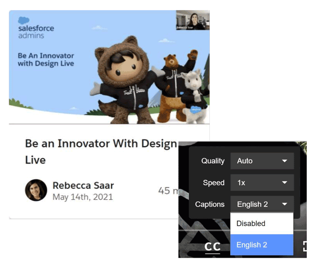
Webinar language is not mentioned
"Need to know what language the webinar is conducted in"
"I wish to know if there are closed captions in other languages"
No information on the level of difficulty
“I’m not aware if the video is something that I can understand."
"Might be too advanced. So would prefer if I could get some info on who the target audience is”

Does not display more content by the author
"I can not validate the qualifications by the author"
"I am unable to see more videos by the same author“

We conducted a Closed Card sorting UX method to determine which features were the biggest pain points for the users. We sent out a survey to 8 participants to arrange the features based on the choice of their priority.We did this to make sure that the development team would be aware that when the research is handed over to them, it is of utmost priority.

The overall approach for the redesign was to make the enhance the experience of the already growing and familiar platform.
We chose to focus on the top 6 frustrations users have with Trailhead Live which are as follows:
1. Declutter the homepage layout
2. Search bar
3. Video category tags and description
4. Personalised Videos
5. Playback controls for the videos
6. Author page


Tested our prototype with a participant. We found minute changes to be done with respect to wordings of some of the buttons and the layout of the cards.
Old

New
AARRR Framework:
UX designers can use AARRR to track the life cycle of a customer and track:
Acquisition- the channels that users have used to reach your app or website
Activation- monitors the initial experience of users
Retention- tracks if users keep coming back
Referral- the percentage of users who have signed up because of referral
Revenue- the percentage of human behaviour that has been monetised
Net Promoter Score (NPS):
We could measure loyalty based on one direct question- Would you recommend this product or service to a friend or colleague?
Average Time Spent with Product:
We could check if the redesign has worked by comparing if the average time spent by the user has increased from before.
1. Stakeholder interviews
Since this is a business centric product, we would have loved the opportunity to have heard the point of view of stakeholders of the product
2. More diverse user interviews
Although we did find time to address the pain points of the users that were not considered a priority too, we could have conducted more interviews from individuals of more diverse backgrounds and careers.

Experienced Corporate ethos

Created engaging presentations

Efficiently collaborated with teammate and peers
Want to know more about my story? Read here >

