
← Case Studies page
Overview
Case studies capture a range of perspectives, as opposed to the single view of an individual you get with a survey response or interview. This gives the opportunity to gain a greater understanding of the subject in hand and reduces the potential for any bias, by diluting the agenda of a particular individual.
About BETSOL
BETSOL is a data management and intelligent automation company offering products and solutions to both enterprises and consumers. Additionally, BETSOL Global IT Services builds and supports end-to-end enterprise solutions, reducing time-to-market for our customers.
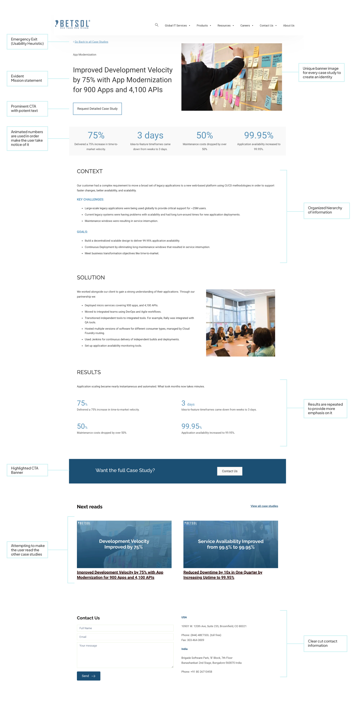
Problem Statement
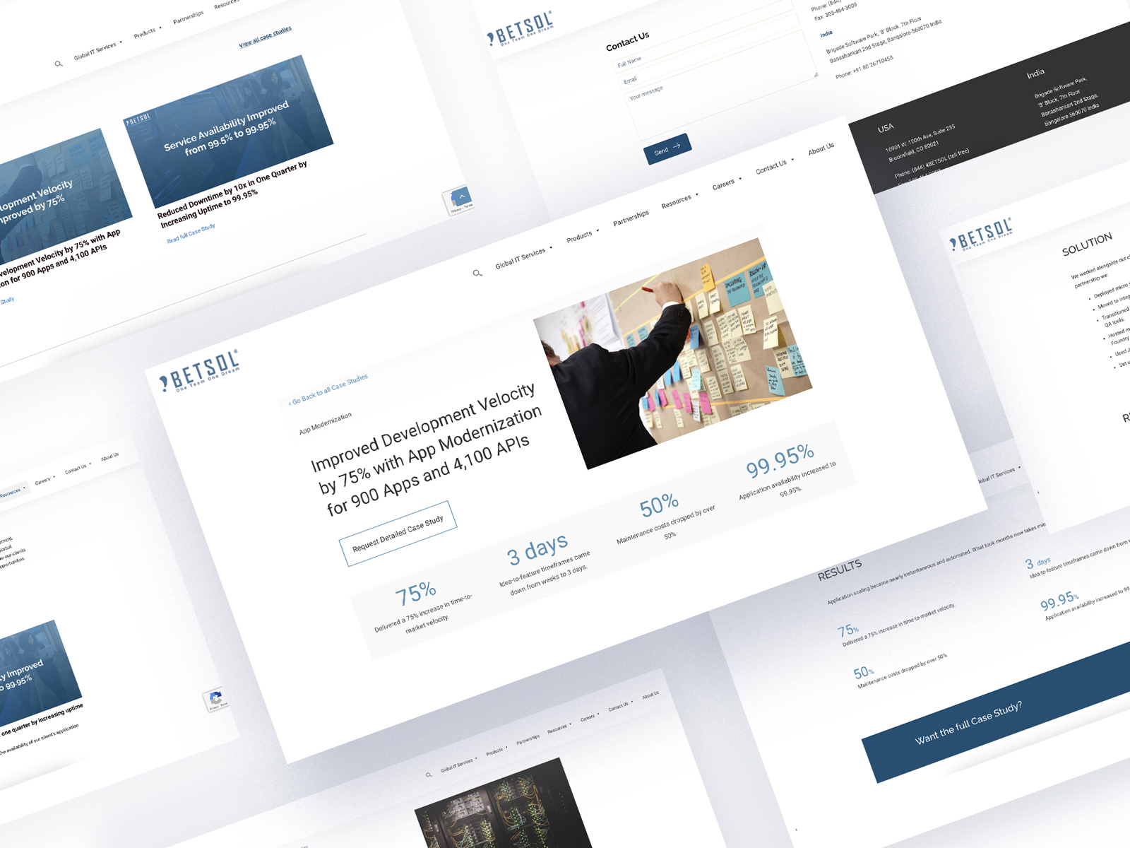
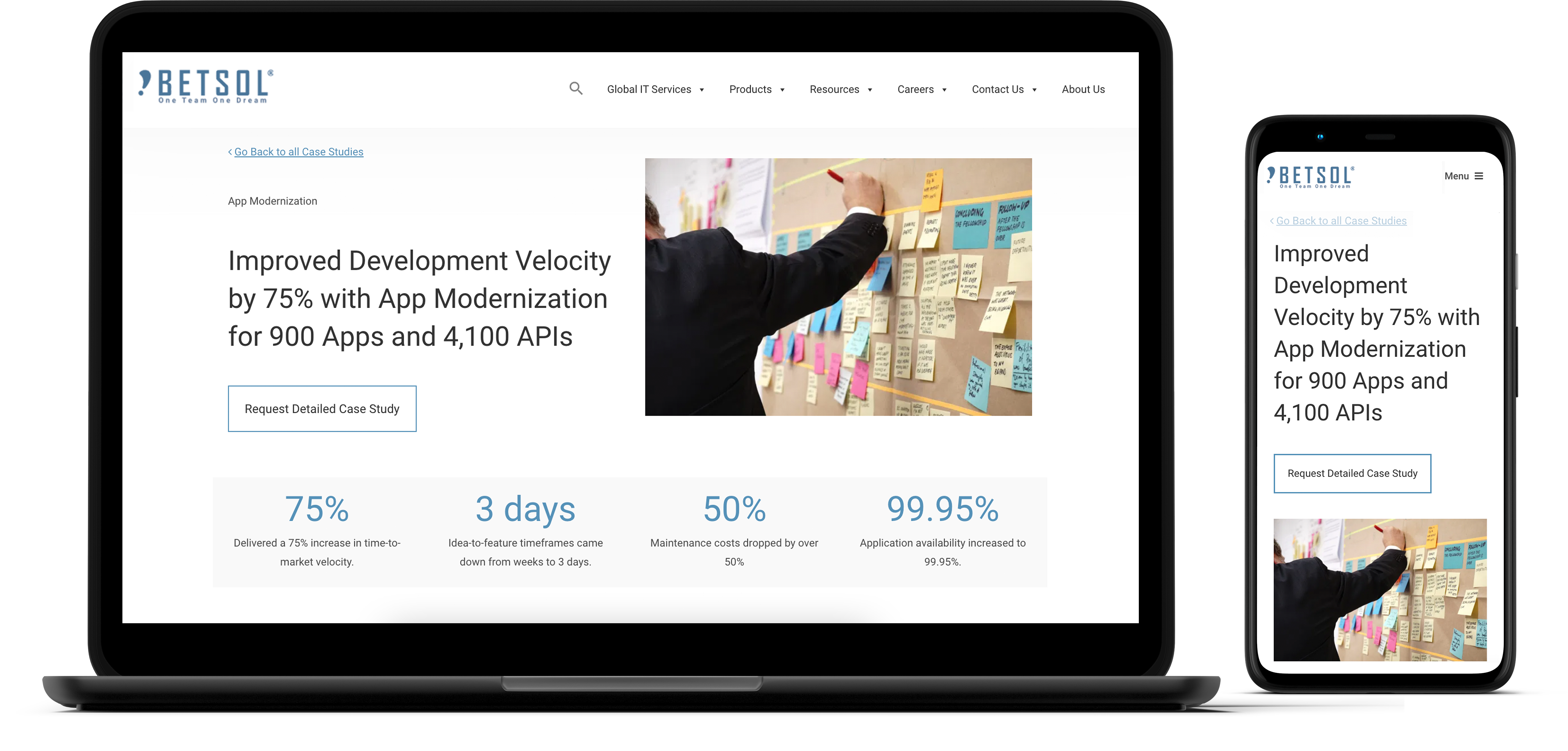
With a growing number of clients and the intention to conscript more, the task was to come up with a case study page that works to attract clients and provide enough information to them without revealing the specifics.
Goals
1. To shed some light into the kinds of work that the company effectuates.
2. To make the numbers of the case study evident for the user
Solution
We designed the current case studies page to provide business critical knowledge to the users. With the following design solutions-
1. Making the numbers involved pop-out
2. Adding images with people in it
3. Adroitly organised layouts regarding the key challenges and solutions
4. Facile ways to get in touch
We aimed to establish trust and confidence in the business’s abilities, increase awareness about the services that BETSOL offers, and ultimately entitle individuals and organisations to get in touch with the company for its business needs.
Competitor
Analysis
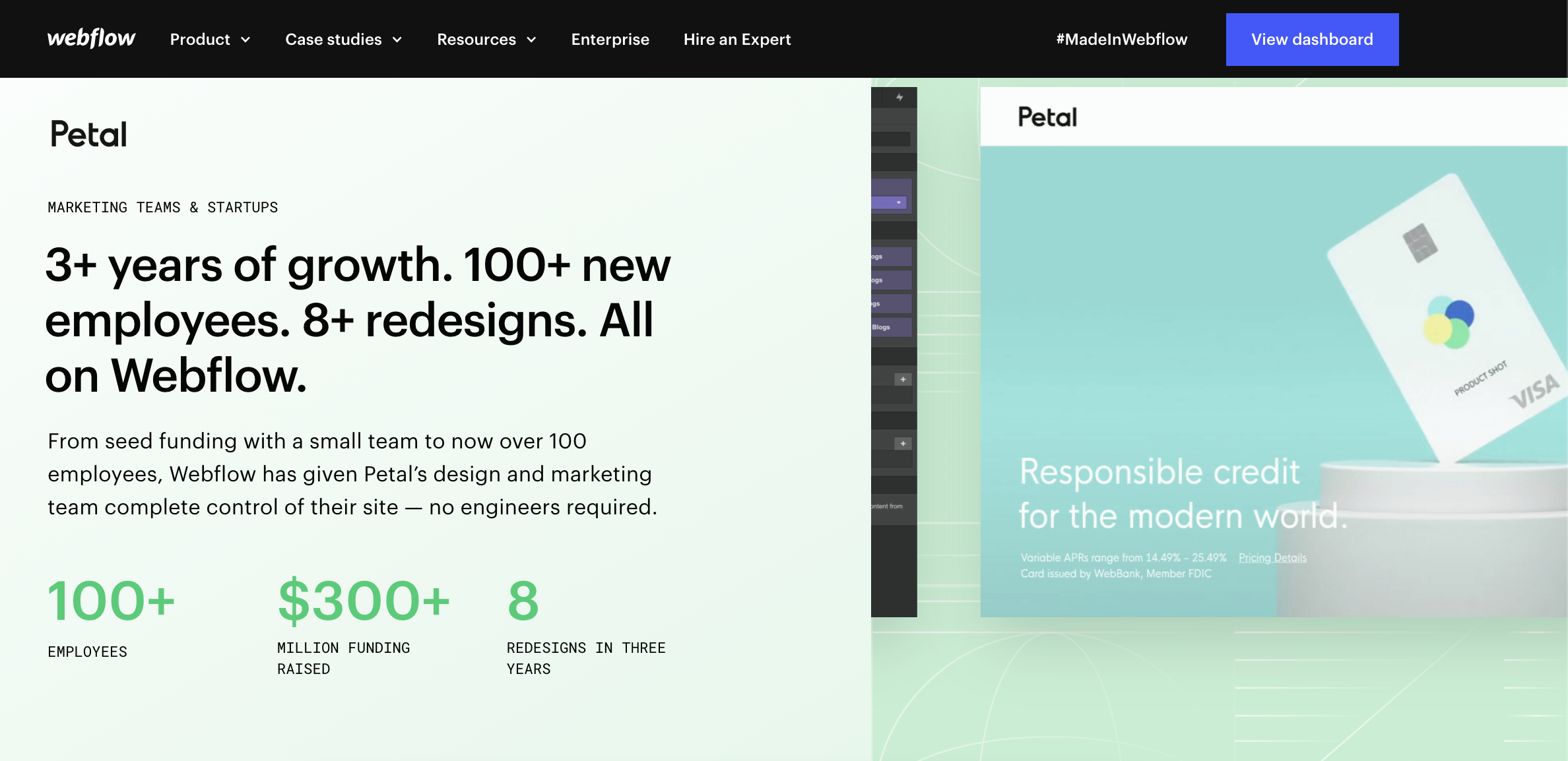
To gain inspiration and identify best practices for the website design, I conducted a competitor analysis. I began by looking at several other case study webpages of other venerable companies, including Acronis, WebFlow, and Carbonite.
One common feature I identified across these websites was the placement & notability of the CTA button to emphasise it as the primary call to action. This was an important design pattern to consider in order to make it easier and more efficient for users to get involved and confabulate.
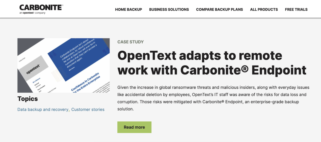
Another design pattern I observed and appreciated was that the numbers were prominently displayed at the first fold of the page. This was an important method to effectively communicate the deliverables that were achieved to the user and better understand what the organisation does.
Tools
Used
1. Figma
2. Adobe Photoshop
3. WordPress
4. Beaver Builder
Design
Recommendations
Conclusion
This project was a tremendous learning experience for me in so many ways. Even though I believe that I accomplished a decent amount of work, I reckon that there is a lot more to be done in the UX design process. This was my first attempt at a UI/UX Case study, and I am looking forward to impacting my ongoing design career with new learning experiences.
Marketing Consultant -Software Engineering
BETSOL, Denver
Mayur was an absolute pleasure to work with. I had complete peace of mind when a project was handed off to him that it would be quality and done on time. His attention to detail and understanding of brand is what will make him an outstanding designer. In addition, his positive attitude kept the team motivated and connected.